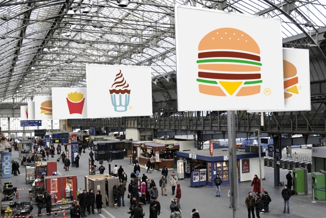
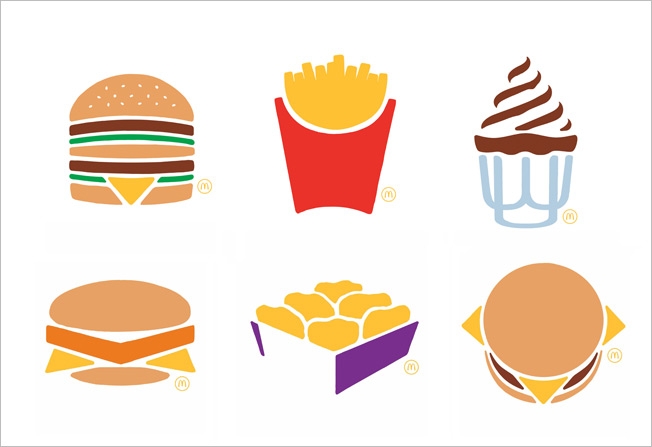
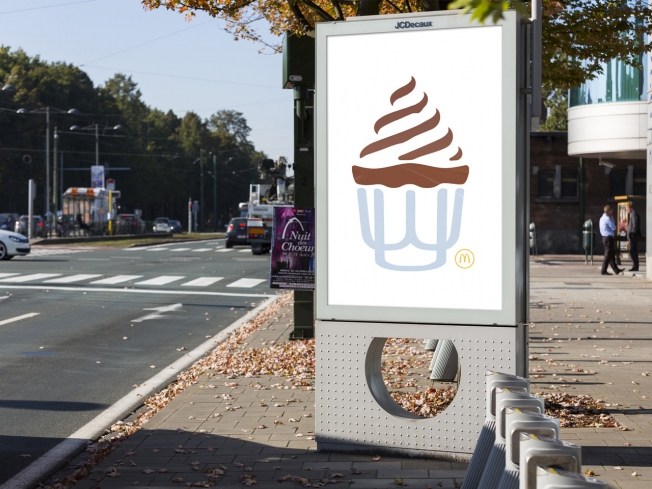
TBWA Paris has developed the newest marketing campaign for McDonald's. The ad is as simple as it gets. No words, no lines, one little yellow McDs arch in a corner of the ad and a picture of one of McDs best products.
We started seeing it with Facebook, Twitter, iOS...and now with McDonald's. More and more they are trying to follow the "simple" icon strategy. Say the most, the simplest way!
TBWA has explained the campaign as "exclusive, simple and universal, just like the six iconic products". These simple icons might work for the apps in our phone, but, is it maybe too simple for a company like McDonald's?

Source: Adweek, CreativeCriminals.com